EN

Capcom Snapshots: Celebration

Oct 25, 2024 // David Poole

We’re celebrating 1 year of Capcom Snapshots with these shares!

Two weeks ago, we asked you to share your best photos that emphasized celebration, and we found some really awesome shots! Take a look below and celebrate Capcom Snapshots along with us after a year of amazing shares!

secondcapture kicks off our celebration with some fireworks from Kunitsu-Gami: Path of the Goddess.

silentgear1 celebrates after a long day of fighting Ganados and rescuing protecting Ashley in Resident Evil 4.

JoaoMayCry shares a “hat’s off” moment from Terry Bogard in Street Fighter 6’s World Tour.

TheREALKoopaTV takes a moment to celebrate a small victory in Apollo Justice: Ace Attorney Trilogy (Phoenix Wright: Ace Attorney – Dual Destinies).

juniaxe celebrates Leon’s first day with a warm welcome at RPD in Resident Evil 2.

Ellmagron ends our little celebration with a shot of a special commemorative figure in Monster Hunter World: Iceborne.

Search #CapcomSnapshots on Twitter/X, Instagram and Facebook to find even more of our amazing entries.

Want to be featured in our next bi-weekly spotlight? In order to be eligible, please be sure to follow the guidelines below:

1. Images must be your own from a Capcom game.
2. No explicit content.
3. Images cannot be altered or feature modified content.
4. Images must not contain any personal information.
By using the #CapcomSnapshots tag, you grant us permission to share your content and social media handle on our website and social media channels.

Next theme: Yellow!

When we started Capcom Snapshots, the first theme was Blue, so now we’re switching up to Yellow to go with the Capcom colors? Capcom games are often very colorful, so we’re sure you can find some excellent yellow shots! Please share your photos by 11:59 AM Pacific on Wednesday, November 6 using the hashtag #CapcomSnapshots for a chance to be featured in our next spotlight. Let’s stay mellow with some yellow!

EN

Resident Evil: Where to Play

Oct 18, 2024 // Capcom Official

In 1996, Resident Evil was first released into the world and has been spreading infectious fun and horror ever since, spanning a number of games over generations of consoles.

For such a long-running series, it’s understandable if you’re as daunted by figuring where to jump in as you might be of taking down a horde of monsters, so we’ve put a guide together to help you pick your first (or next) Resident Evil game.

Resident Evil VR

If you want to put yourself right in the center of the action, the following games have VR versions:

  • Resident Evil 4
  • Resident Evil 7 biohazard
  • Resident Evil Village

Thoughts from Capcom USA Staff

Looking for more advice? We asked the staff around the Capcom USA office for their recommendations:


“If you’re a new player, start out with Resident Evil 2 (2019). It’s a great jumping-on point for the series.”
“Resident Evil 7 biohazard is the scariest one! Play that one to lose sleep.”
“Play all of them.”

EN

Capcom Snapshots: Zombies

Oct 11, 2024 // David Poole

The undead are rising to the occasion for these Capcom Snapshots!

Two weeks ago, we asked for you to share your zombie photos for the spooky season, and we got a great turnout. There was some great variety in the options for these undead hordes, and we hope you like our selections below!

InfectiousRebel starts things off with this scene full of dread in the opening moments of Resident Evil 2.

RCase takes us to Shade Man’s zombie robot-infested stage in Mega Man 7, part of Mega Man Legacy Collection 2!

AnimuStewshine welcomes us to their humble abode in Monster Hunter World: Iceborne, where they’re just dying to meet you.

juniaxe tries to make it through the fiery field of zombies to get Leon to the Raccoon City Police Department in Resident Evil 2.

TheREALKoopaTV comes across some Pantheon Corpses in Mega Man Zero 4, part of Mega Man Zero/ZX Legacy Collection!

MysterSack shows that even zombies can express love, as Lord Raptor demonstrates his affections for Hsien-Ko in Vampire Savior: The Lord of Vampire, part of Capcom Fighting Collection!

Search #CapcomSnapshots on Twitter/X, Instagram and Facebook to find even more of our amazing entries.

Want to be featured in our next bi-weekly spotlight? In order to be eligible, please be sure to follow the guidelines below:

1. Images must be your own from a Capcom game.
2. No explicit content.
3. Images cannot be altered or feature modified content.
4. Images must not contain any personal information.
By using the #CapcomSnapshots tag, you grant us permission to share your content and social media handle on our website and social media channels.

Next theme: Celebration!

Can you believe it’s been one year since we started doing Capcom Snapshots? We wouldn’t be where we are today without you, so we want to celebrate by seeing some of your best celebrations in our games! Please share your photos by 11:59 AM Pacific on Wednesday, October 23 using the hashtag #CapcomSnapshots for a chance to be featured in our next spotlight. It’s time to celebrate and have a good time!

EN

Capcom Pet of the Month: October 2024

Oct 02, 2024 // David Poole

We’re putting the spotlight on our Capcom Pet of the Month for October!

Meet Mancha (Brazilian Portuguese for “Spot”), a once-stray dog that traded the streets for the comforts of a loving home. Despite his occasional grumpiness, he’s quite the affectionate fellow, especially towards his human family and his unlikely best friend, Eevee the bunny. Their adventures together often lead to hilarious mishaps, but their bond is undeniable.

When he’s not getting into trouble with Eevee, Mancha can often be found lounging around the house. He’s quite the lazybones, and he’s taken a particular liking to the soft comfort of his human’s bed. It’s his happy place, and he’ll often sneak in for a nap whenever he gets the chance.

Mancha has certainly adjusted well to his new life. From a stray to a spoiled house pet, he’s come a long way. His days are filled with food, cuddles, and plenty of opportunities for mischief. And while he may grumble from time to time, there’s no doubt that he’s found his forever home.

Tune in on the first Wednesday of every month to see the next Capcom Pet of the Month!

EN

Director’s Testimony – Behind the Scenes –

Sep 30, 2024 // Satoru Sakai

Hi, everyone. How do you do? I’m Satoru Sakai, the director and game planner of Ace Attorney Investigations Collection. I know that many of you have been hoping for a port of the Investigations series, and I’m sorry for the long wait. But with the game’s release back on September 6th, we were finally able to bring an updated Edgey-poo to you all. What a load off of my shoulders now that everything is done!

I grew up in the Game Boy Advance era of games, so it was a real joy for me to come in every day and work on the port of an Ace Attorney game – a series I’d been hooked on as a child. I also felt a lot of pressure to do right by a classic like Ace Attorney Investigations: Miles Edgeworth.

I hope everyone will love what we’ve done, including the visually upgraded Edgey-poo, as much as I do.

Now then, I have never written anything like a dev blog before, so I had a tough time coming up with what I should write about. I figured our art director and our localization director would each cover our graphics production process and localization-related issues, respectively, so…

I guess I’ll talk about the development.

It’s true that the two titles included in the Investigations Collection are ports, but we also figured that this would be a lot of people’s first time experiencing them too, so this is what the producer tasked me with:
“This may be a port, but I don’t want it to just be a carbon copy of the original games. I want it to be something that looks and feels like a modern game. I want to do something about the things that cause players stress so that they can play it with minimal frustration through to the end.”
Basically, he wanted not just the obvious visual upgrades, but also, features that would be expected of any game being produced in the modern era.

And so, as this collection’s director and lead planner, I’d like to walk you behind the scenes of the development of Investigations Collection – from what features we added to the Nintendo DS and smartphone versions to the new UI design – and share with you some of our thought process.

First up is the very first thing you see when you start the game – the Title screen.

Title Screen
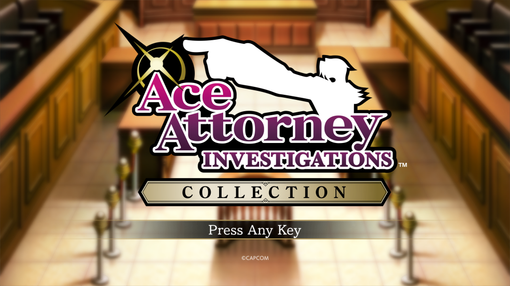
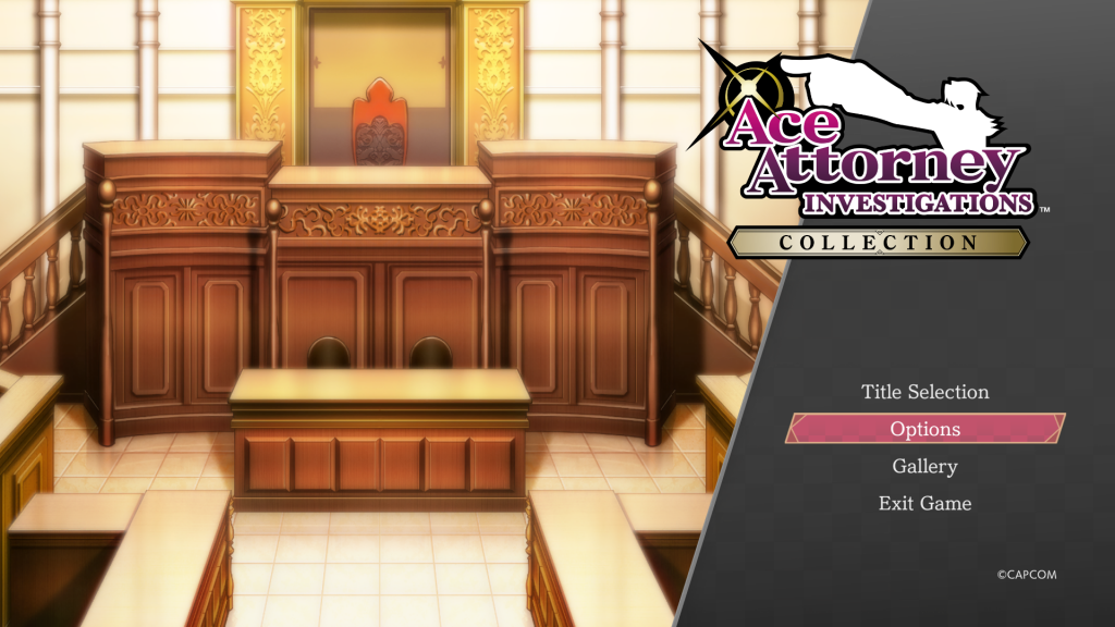
When you first boot up Ace Attorney Investigations Collection, you’ll be greeted with a background picture featuring the courtroom and the main menu. Because this is where you’ll take off into the two games from, we called this the Launcher screen internally.

As a little bit of fun, we decided to have the background change according to your save file as you progress through the game. (There was a similar feature in The Great Ace Attorney Chronicles, which showed you the 3D location background of your most recent save file.)

Since the Title screen is something new for Investigations Collection, it exists as a separate entity from the main games. That’s why I wanted to make it feel a little more connected to the games themselves by creating even the slightest link between the Title screen and what’s going on in the story as you play.

But the background doesn’t change just once per episode – it actually changes all throughout. So, I recommend that you try saving in all sorts of places. I think you’ll find our selections to be quite interesting!

(Games that make small changes to their Title screen when you return to it or after you’ve finished the game are great, aren’t they?)

The pictures we used are from a variety of locations, including background maps and story illustrations. But it would’ve been boring to use them as is, so the designers added some lighting and other special effects to make them look extra good. For example, if you let the courtroom background scroll for a bit, you’ll notice that it looks like there’s sunlight pouring in from above. We added these kinds of custom special effects to each and every background on the Title screen.
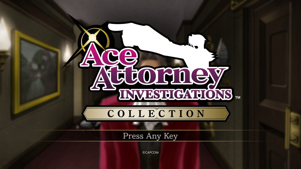
My favorite is the one for AAI: ME, Episode 3. Of course it is.

Also, the song playing on this screen is a new piece that was composed just for Investigations Collection!

About the Background Music

The title screen music is a track called “Prelude to Pursuit – Search for the Truth”.

The sound team really outdid themselves with this piece that not only sounds cool and uses phrases from the Pursuit themes of both games, but also brings out Edgey-poo’s outward coolness and hidden inner passion! As someone who loves the Pursuit themes, I absolutely adore this new track. But it’s not just this one track – all of the new arrangements are amazing and I kept listening to them on loop as I worked. Thank you so, so much, sound team!
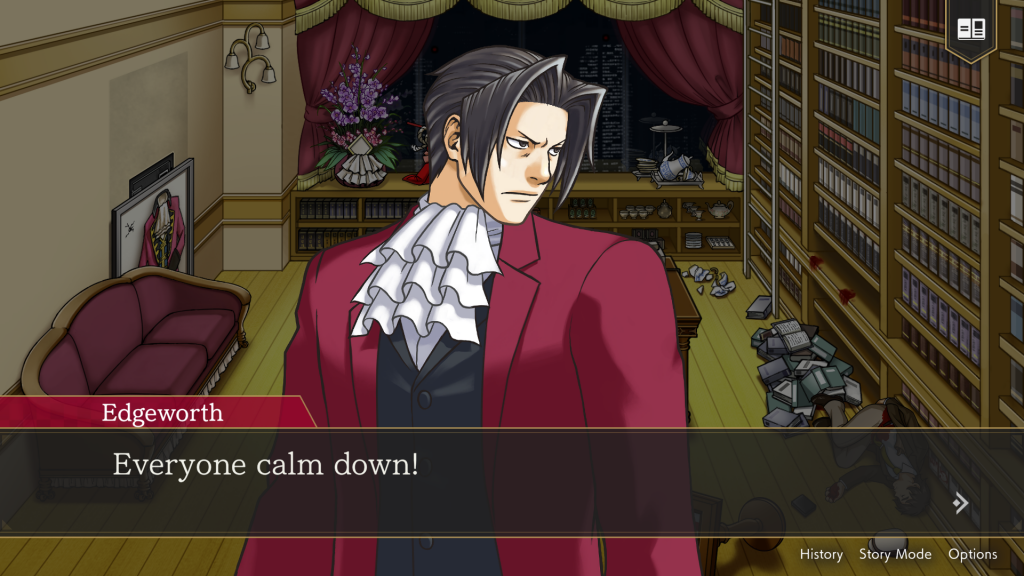
Yes, sir.

We had originally suggested that a blended arrangement of “Miles Edgeworth – Objection! 2009” and “Miles Edgeworth – Objection! 2011” be the Title screen track, but both of those pieces are based off of “Triumphant Return – Miles Edgeworth”. And since there are so many arrangements of those pieces already, we decided to go with the Pursuit themes as the basis this time around.

Now it’s time for our next segment – a look at the new useful features we added to Investigations Collections.

Useful Features
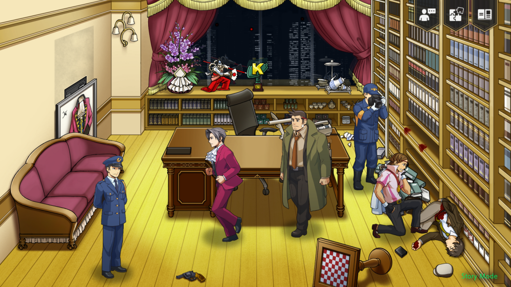
And here we have an Edgeworth on autopilot.

Story Mode

The Story Mode feature was also in The Great Ace Attorney Chronicles and Apollo Justice: Ace Attorney Trilogy, so some of you may already be familiar with it. Basically, it’s a feature that will automatically solve all the puzzles and progress the story for you. It was so well received in the past that we just had to implement it in Investigations Collection as well. Use it when you get stuck during a Logic or Confrontation part, or use it to simply enjoy the story! It’s all up to you!

There is one thing I have to come clean on though, and that is that when you turn Story Mode on during an Investigation segment, the game will restart from the beginning of that Investigation segment. This is something we had to do because the player character can move freely about the map, and making the game automatically control the character correctly was an incredibly tough thing to pull off.

You could say it’s me being very particular about it, but if you’ll lend me an ear, I will tell you how much of a struggle we had…

There was a time in the middle of development when, depending on where you were standing when you turned Story Mode on during an Investigation segment, Edgey-poo was unable to correctly maneuver around objects. As a result, he would get caught on things like tables or at corners and then stutteringly run in place… This bug would occur time and time again and was especially easy to trigger on smaller maps and when there were many objects (like tables or NPCs, etc.) around.

Because having him move around the map automatically is a feature that was outside of the original dev team’s expectations, there was only so much the programmers could do to manipulate how the game processed things internally… Furthermore, the amount of testing we would’ve needed to do to ensure that Edgey-poo wouldn’t get caught on anything by placing him on every conceivable spot on every applicable map was just unrealistic. My team and I tried to come up with all sorts of different ways to implement the feature, but with the limits of the budget and time we were given, we settled on the implementation you see in the final version of the game. It was a really hard decision to make, and it’s something I still have a few regrets about.

(By the way, you can also read about the struggles director and planner Mr. Kougou faced when implementing this feature in The Great Ace Attorney Chronicles on his blog entry. It sounds like he and his team also had a rough time of it…)


Check Mark on Things You’ve Already Examined

During Investigation sections, as Edgey-poo approaches something that can be examined, a little speech bubble will appear above his head. This was implemented to make it easier to see what is examinable. In the Nintendo DS and smartphone versions, the only way you could tell if something was examinable or not was if a button came swooshing out of hiding from the bottom right of the screen. But this time, we knew that people would be able to play these games on large screens and in full HD, so we figured it would be better to place a bubble closer to the character you were controlling, thereby reducing the distance your eyes would have to move as well.

In addition, we made it so that anything you’ve finished examining would get a little check mark on it. Furthermore, if something should change in the course of your investigation, the little check mark would disappear to let you know that there’s something new to discover if you examine that item again. Compared to the mainline games, there are more instances in the Investigations series where an object needs to be examined more than once, so while this feature may seem boring and insignificant, it’s actually quite an important one!

(Because of the “examine the same place multiple times” gameplay, there were a ton of bugs related to this check mark feature. I even have a story about something that we had a really tough time with, but I think I’ll save that for some other time…)
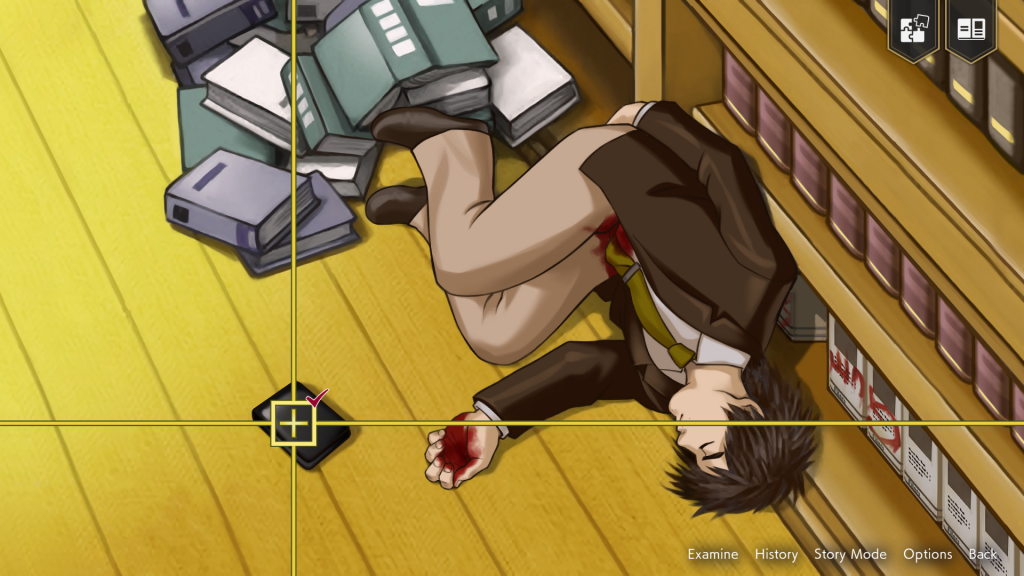
We even put check marks on the cursor for when you examine 2D scenes!

And that about covers the useful features, I think. Lastly, let’s take a peek at the gallery.

Gallery

The gallery contains Accolades, in-game illustrations, and character animations. In addition, we’ve included some documentation from the Nintendo DS version’s development and even orchestral arrangements for you to listen to.

But before we start…

There are spoilers for the main games in the in-game gallery itself, so if you haven’t finished the games yet, please be careful before heading in! I mean it!

I know I’m sidetracking a little here, but dialogue boxes will pop up in locations other than the gallery, too, to alert you to the presence of spoilers. While the games are more than ten years old, Ace Attorney is one of those series where I really want everyone to enjoy the story and the tricks behind each mystery. I didn’t want people to accidentally spoil themselves on who the real culprit is ahead of time, so while I know the boxes might be annoying when they pop up, I hope you’ll bear with them!

In fact, we took care not to spoil anything as we made things like promotional trailers, as well.

(I say that, but I had absolutely no qualms about showing the rascal you see the instant you start up the game all over the place, though.)
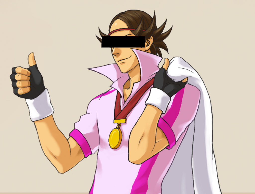
I’m talking about you, buster.

Gallery Screen

We wanted to give a hand-drawn, vintage feel to the overall design of the gallery. It’s a little different from the Art Deco taste of the UI design in the main game, though, isn’t it? We based the direction of the design off of the jacket illustration of the first game’s orchestral mini soundtrack, which we received from the producer.
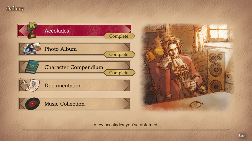
That exact image is also on the right-hand side of the Gallery screen.
He really is handsome here, isn’t he?

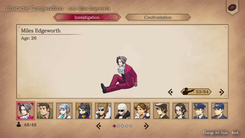
Character Compendium

Edgey-poo with his hands tied behind his back!
Edgey-poo lying flat on his face! Wow!

The Character Compendium is where you can view each character and their animations – even those that were only used once in the games – as many times as you’d like.

The chibi characters this time around, and especially the ones in the HD art style, are of higher quality than ever before thanks to the art designers’ hard work. (To all the designers, I can’t thank you enough…!) Because you can see each character’s full body design in the Compendium, you might even spot something you would never be able to otherwise because it was being blocked or covered up by something in the main game. So, I hope you’ll give them more than just one quick look!

We included every character we could, but there were a few we couldn’t due to how their animations are put together. I really regret not being able to include Edgey-poo sliding down a pole…
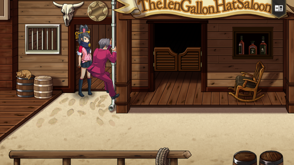
I’ll just put this here so we can look at it whenever we want.
Sorry, Edgey-poo.

Documentation

In the Documentation section, we’ve included some of the most interesting rough sketches Mr. Iwamoto drew during the original Nintendo DS version’s development.

There’s sure to be a few that will make you say, “Who the heck is that!?” and there are sketches that outline in great detail how certain motions were to be animated, among other things. From his sketches, you’ll see just how much trial and error went into each character before they reached their final version. You’ll also see a few of Mr. Iwamoto‘s random doodles here and there, so if you’re a fan who is dying to catch a glimpse of Mr. Iwamoto’s playful side, you’ve really got to check these out!
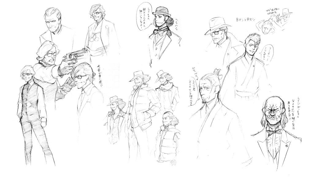
I recommend this page that shows a bunch of sophisticated-looking middle-aged gentlemen
who are trying to push Edgey-poo into following in his father’s footsteps
(so they’re probably all of Fender).

In Conclusion

If you’ve made it this far, thank you for reading! There is so much more I want to share, but I’ve written too many words already, so I’ll have to call it a day here for now! With this revival of the Investigations series 15 years later, I sincerely hope that this collection will inspire more people to become fans of Miles Edgeworth, or “Edgey-poo”. See you all later!
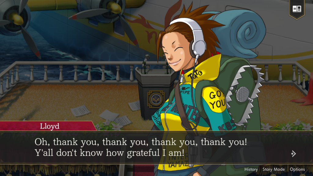

Hello, I’m Shunsuke Nishida, the producer of AAIC. As this is the last blog post, I’d like to leave a brief message here.

Throughout this year, I had secretly wanted to make 2024 the year of “Edgeworth Fes”, and I had intended to highlight him in multiple ways. Part of my goal was achieved through special collaborations, wonderful T-shirt designs, and other original merchandise (although some of them were available only in Japan). But you completed it with your numerous pieces of commemorative fan art, lovingly assembled in-store displays, and even a handmade diorama I saw on social media. I was totally astonished!

I really appreciate everyone involved on this project and all of you fans who have supported the Ace Attorney series to this day. If you’ve read this far, I’m guessing you have already played AAIC, but I hope you will enjoy all that AAIC has to offer!

EN

Capcom Snapshots: Heroes

Sep 27, 2024 // David Poole

Not all heroes wear capes in these Capcom Snapshots!

Two weeks ago, we asked you to submit your favorite Capcom heroes, and while we didn’t see some of the heroes we were expecting, we did get quite a few great choices. Here are our heroic selections!

OguzhanSivri_ starts things off with The Watcher, the Metro City hero in Street Fighter 6’s World Tour.

xnavsy shows our prolific prosecutor, Miles Edgeworth, meeting the Steel Samurai in Ace Attorney Investigations Collection (Ace Attorney Investigations: Miles Edgeworth).

secondcapture captures the brilliant hero of Kunitsu-Gami: Path of the Goddess, perfectly showcasing Soh’s majestic flair.

SakharineDen gives us a look at their Arisen and their Pawn from Dragon’s Dogma 2. Heroes all, you can’t go wrong.

TheREALKoopaTV shares a shot of the Amazing Nine-Tails, the hero of Nine-Tails Vale in Apollo Justice: Ace Attorney Trilogy (Phoenix Wright: Ace Attorney – Dual Destinies).

BIO_SIMPLE closes things out with a heroic rookie cop on his first day and an elusive super spy in Resident Evil 2.

Search #CapcomSnapshots on Twitter/X, Instagram and Facebook to find even more of our amazing entries.

Want to be featured in our next bi-weekly spotlight? In order to be eligible, please be sure to follow the guidelines below:

1. Images must be your own from a Capcom game.
2. No explicit content.
3. Images cannot be altered or feature modified content.
4. Images must not contain any personal information.
By using the #CapcomSnapshots tag, you grant us permission to share your content and social media handle on our website and social media channels.

Next theme: Zombies!

It’s spooky season, and with the release of Dead Rising Deluxe Remaster, there’s no better time to capture the iconic zombies of Capcom games. Please share your photos by 11:59 AM Pacific on Wednesday, October 9 using the hashtag #CapcomSnapshots for a chance to be featured in our next spotlight. Look alive out there!

EN

The Truth Behind Graphics Production

Sep 24, 2024 // Hiromichi Iwasaki

Hi, everyone. I’m Hiromichi Iwasaki, art director of Ace Attorney Investigations Collection. It’s been a week since the game’s release. Are you having fun playing it every day?

…What? You still haven’t bought it yet…? No, no! That won’t do! You haven’t seen the “truth” to the meaning of life if you haven’t played the Investigations games yet… Well, in that case, just for you, I’ll spill the beans about a few of the changes to the graphics from the original version to the Investigations Collection. And then, after you’ve read what I have to say, you should be super ready and hyped to play it!

(Or, I hope so, in any case…)

Ace Attorney Investigations Collection was built off the backs of the Nintendo DS and the smartphone versions of each game in the collection, but the biggest hurdle we had to overcome in creating the graphics this time around were the chibi characters, which are an element unique to the Investigations series. There are over 100 of these little character avatars that go about their business on those little Investigation part screens with a total of over 1,200 different animations. Watching those finely drawn sprites glide smoothly around a small screen is a ton of fun! …is a fine sentiment to have, sure, but to recreate them for a large, full HD screen is a totally different story. “Just how are we going to deal with the sheer volume of work required?” was a very real question we had to face during this game’s production.

After all, we had intended to base our sprites off of the ones from the smartphone version. Those sprites’ outlines were touched-up versions of the original Nintendo DS pixel art sprites that had simply been doubled in size, and everything else was still in the original Nintendo DS resolution and size. Making all of these parts mesh with the full HD-resolution backgrounds meant that we would need to make everything be almost six times bigger than the original size… which was about the same amount as work as drawing one of the larger character talking sprites…

Furthermore, each animation in this case was made up of a series of individually hand-drawn pixel art sprites that are shown in quick succession to create the movements we see onscreen. Take Edgeworth’s walking animation, for example. One loop consists of 6 individual sprites, and we needed to create 1 set of these for each of the 8 directions (up, down, left, right, and the diagonals) he can move in. And that’s just for his walking animation. There’s still his running, surprised, objection, and many, many other animations to account for. On top of that, we had to create animations for Gumshoe, Kay, and all the other characters in the same way. “Just how much work are we talking about here???” I wondered. I felt faint just thinking about it…

But since we were re-releasing the games, we knew we couldn’t just leave them be – we had to do something to spruce them up! We first looked into how we could use the pixel art sprites as a base and work on upgrading them from there. It would be so much work to re-draw everything from scratch, after all, so of course we couldn’t choose to do that right off the bat…

We tried out a bunch of different options such as doubling the pixel density and applying a filter to smooth things out, but nothing good came of these experiments. We also looked into making everyone into 3D models, but to make over 100 models within the timeframe we were given and recreate the look and refined movements of the pixel art sprites in 3D – it was simply unrealistic from a workload and stylistic point of view. What’s more, even though we were going to upgrade all the backgrounds into full HD, they were still going to be in 2D, so we felt it would be hard to achieve a sense of cohesion between the 2D backgrounds and 3D models.

We tried everything we could think of, but in the end, there was only one thing we could do: steel ourselves for the pain and tears that were sure to come as we walked down the simplest, yet hardest road. We would redraw everything from scratch. It was the only way to ensure that the sprites and backgrounds wouldn’t clash with one other. To everyone who worked on these sprites, please forgive me…

The next hurdle in our way was how to create each character’s new design. The original sprites were tiny pieces of pixel art which left too much room for personal interpretation when remaking them in a much higher resolution. Plus, in order to make them the right size relative to the objects in the backgrounds, we had to make the new sprites 5.5 heads tall. Usually, chibi or super-deformed (SD) characters are designed to be a cute 2 or 3 heads tall, but at 5.5 heads, our characters would occupy a space between the “cute” and “realistic” body proportion types. However, this allowed us to strike a delicate balance between “adorable” and “cool” so that our chibi characters could be seen in either light, depending on the situation.

To summarize, we had wanted to keep the look and feel of the original pixel art sprites while making them chibi at an unorthodox 5.5 heads and they had to fit in visually with the larger talking sprites you see during Confrontation parts… The only person who could clear all these difficult hurdles was him! Yes, it was time for Miles Edgeworth… I mean, Ace Attorney Investigations series character designer Tatsuro Iwamoto to step in and direct and design the chibi characters.

The first thing we asked of Mr. Iwamoto was Edgeworth’s new design, and it really shouldn’t have come as a surprise, but we received one that perfectly balanced the cute and realistic styles straight away. I think this is down to the fact that he had worked on the series’ character designs in the past, so of course he had the perspective and pickiness to know just how to work so much into Edgeworth’s new design. “What a relief!” I thought. I could see a real glimmer of hope…!

And thus began the task of redesigning every character. But with over 100 of them, we decided to have Mr. Iwamoto focus on Edgeworth and the other main characters, while the remaining characters would be designed by internal staff at Capcom and passed along to Mr. Iwamoto for his approval and touch-ups.

Since we were redesigning everyone, one thing we were able to do that the original pixel art couldn’t (due to technical limitations at the time) was to make each of the chibi characters their correct relative size. I hope you’ll pay attention to how unexpectedly tall or short each character is as you play.

After nailing down each character’s design, we had to create their animations. Work-wise, our process was similar to how other types of hand-drawn animations are produced. Referencing the original pixel art sprites, we drew each animation to have the same number of frames and colored the line art in. At this point, the sprites would have moved exactly like their pixel art counterparts, but there were a few animations where we used a 2D animation tool to help add a few frames in between to make things look extra smooth.

Initially, we had considered using the animation tool’s auto-fill feature to fully create the animations, but when we actually tried it out, the animations it produced didn’t look right at all and felt really off. After a lot of trial and error, we eventually settled on the process we did. In the end, I think our final animations have the same slightly imperfect, human touch that regular hand-drawn animation tends to have.

The toughest step of the animation process for us was the initial line art drawing phase. Because of the sheer number of them, creating all of the high-res drawings from the small pixel art sprites was a daunting task, even for the talented artists on this title who were used to drawing such illustrations. With small pixel sprites, the viewer’s brain fills in a lot of the gaps, but when we made them in full HD, we had to carefully fill in all those gaps ourselves. That eye that was only one pixel originally – should we make it open or closed? Should we make Edgeworth’s bangs and cravat bounce? We mulled over every tiny dot as we worked to solidify each visual detail.

However, looming overhead was our final deadline, and had we wanted until we finished designing all of the characters before getting started on their animations, we would have never made it. So we decided to start creating each character’s animations as soon as their design had been finalized instead. Thus, the character designing phase became a race against time, and many a day were spent submitting designs to Mr. Iwamoto and receiving his feedback for us to implement.

And then, as we fell further and further behind schedule, and it became harder and harder for us to complete more than a handful of the line art drawings, I began to wonder if we had any hope of finishing on time… But everyone on the team fought hard, and we pulled through in the end somehow. I have nothing but gratitude for the designers who worked so hard every day, for the rest of the dev team who supported the art and design section, and for Mr. Iwamoto himself, who not only had his character design work to take care of, but wound up helping to draw a portion of the line art as well!

Another small thing we added this time around was a bit of lighting effects to help the chibi characters blend in better with the background (HD art style only). You should be able to see a difference when Edgeworth moves around on a nighttime background, or one with deep shadows. I hope you’ll check it out!

All that said, the chibi characters sprites aren’t the only graphical improvements we made. We also updated the way you interact with certain screens like the Organizer and the Logic screens, and the look of others such as the Mind Chess screen from Prosecutor’s Gambit. By borrowing elements of Art Deco and using straight lines throughout, we were able to give the UI a modern yet Edgeworth-like elegance. The Logic screen was given a jigsaw puzzle-like design with a pleasing animation when the correct pieces fall into place. I hope you’ll feel like you’re right there inside Edgeworth’s mind when you solve the puzzles for yourself!

As for the Mind Chess screen, we took care to preserve the feel of the original version when recreating all the 3D models. We sanded down all the straight edges and harsh corners and adjusted the lighting so that the chess pieces would blend in better with the background. I think they turned out looking pretty cool, but what do you think?

Backgrounds and in-game illustrations, the larger talking character sprites for the Confrontation parts, evidence thumbnails – we based all of these items and more on the original assets when making them full HD and in 16:9. And when something wasn’t wide enough to accommodate a 16:9 widescreen presentation, we would expand it by adding to the base illustration. When there wasn’t enough definition, we would fix that by adding those missing details in. In fact, you can even read what it says on the cover of Edgeworth’s law book now!

We also updated the 3D models of all the evidence into high polygon count ones. It might be hard to tell because we made each piece look like their illustration counterparts, but we smoothed a lot of things out! I know it’s not as impressive as the other upgrades, but it would make me very happy if you took note of these small changes, too.

Another point of note is that we had to implement a lot of new assets for each language version of Ace Attorney Investigations Collection. Especially for Prosecutor’s Gambit, which was getting its first international release, we worked extra hard to make sure that nothing felt out of place in each language version since we were starting completely from scratch. After all, I think it’s pretty universal to feel disappointed when you spot a sloppily localized asset, you know?

Of course we had to make new “Objection!”-type speech bubbles, but we also had to make new pamphlet lettering and street sign designs, convert temperatures from Celsius to Fahrenheit, redesign some vending food packaging, and even localize the logo for a TV’s brand name and Edgeworth’s business card. Before we knew it, we’d ended up doing all of this just to meet our localization director Janet’s obsessive… I mean, passionate level of attention to detail…

(Janet: I’m sorryyy! And thank youuu…! sob)

You can play in any language you’d like by going to the Language settings in the Options menu, so for all you multilingual players out there, I hope you’ll enjoy seeing what’s different in each language version.

(I don’t thiiink there’s someone out there who can understand all 7 languages, but you never know, I guess…)

While we completely remade from scratch or up-rezzed all sorts of art assets from their original Nintendo DS versions, this collection wouldn’t be as good as it is without the high-quality work of the original. Therefore, we took great care not to destroy what came before as we made our new version. For those who have played the original or smartphone versions, I believe you’ll enjoy this version as well.

Well? Do you see the “truth” to the meaning of life now? I swear, life really is a lot more fun with Ace Attorney Investigations Collection in it!

(Is this really any way to invite someone to play…?)

Next time, it’ll be our director, Mr. Sakai’s turn. A great admirer of Edgeworth, what “truths” behind the development of Ace Attorney Investigations Collection will he bring to light!?

EN

Capcom Snapshots: Investigation

Sep 13, 2024 // David Poole

Our investigation revealed that these Capcom Snapshots are fantastic!

Two weeks ago, we asked for your Investigation photos form Capcom games to celebrate the release of Ace Attorney Investigations Collection. Not only did we see a great selection of Ace Attorney shares, but we even had some brilliant deductions from Resident Evil 4. Check them out below!

AderenaEdge gets caught in some investigative journalism with one miss Tabby Lloyd in Ace Attorney Investigations Collection (Ace Attorney Investigations 2: Prosecutor’s Gambit).

lovers_nero shows off Leon’s willingness to investigate the whereabouts of this officer’s partner in Resident Evil 4.

TurnaboutWOT starts to inquire what exactly Kay Faraday is doing in Ace Attorney Investigations Collection (Ace Attorney Investigations 2: Prosecutor’s Gambit).

juniaxe gives us a look of Ada Wong’s investigative skills in Resident Evil 4’s Separate Ways.

Pheeniex_ takes us back to Phoenix Wright: Ace Attorney Trilogy to look at Luke Atmey for his deductive reasoning in Phoenix Wright: Ace Attorney – Trials and Tribulations.

Unprofessionlsm provides one last investigation from Ace Attorney Investigations Collection, and admittedly… we’re taking bets on if Edgeworth will follow through.

Search #CapcomSnapshots on Twitter/X, Instagram and Facebook to find even more of our amazing entries.

Want to be featured in our next bi-weekly spotlight? In order to be eligible, please be sure to follow the guidelines below:

1. Images must be your own from a Capcom game.
2. No explicit content.
3. Images cannot be altered or feature modified content.
4. Images must not contain any personal information.
By using the #CapcomSnapshots tag, you grant us permission to share your content and social media handle on our website and social media channels.

Next theme: Heroes!

IT’S MAHVEL BAYBEE! With the release of MARVEL vs. CAPCOM Fighting Collection: Arcade Classics, we want to celebrate by showcasing iconic heroes in Capcom titles. Please share your photos by 11:59 AM Pacific on Wednesday, September 25 using the hashtag #CapcomSnapshots for a chance to be featured in our next spotlight. Time to go, hero.

EN

Localization and Technology, Or: How Over a Decade of Progress Affects Your Localization

Sep 06, 2024 // Janet Hsu

It’s finally here! Over 10 years later, the second Investigations game is finally officially available starting today! I hope you are as excited as I am!

I’m Janet Hsu, localization director of Ace Attorney Investigations Collection, and I’m here for a special one-off about the more technical side of localization. I’ve talked at length about my localization philosophy in my The Great Ace Attorney blogs, so I figured I’d take this rare chance to talk about the differences in my experience of localizing the first Investigations game into English in 2011 and the second into multiple languages in 2024.

A lot has changed in these last 13 years. By 2011, Capcom had the MT Framework game engine, but the first and second Investigations games ran on their own custom engines. The screens on the Nintendo DS were also very small and in 4:3 aspect ratio. The simultaneous worldwide release of multiple language versions wasn’t the ironclad industry standard it is now, which, when combined with the storage limitations of a game cartridge or DVD, affected even how game assets were named. Game development was like a totally different world back then.

So come along now as I show you how old I am by regaling you with stories of “back in my day” – localizing games edition!

Engine Improvements and the UI

In a series like Ace Attorney, the UI is everything – it’s the way all information is conveyed and the way the player interacts with the game. Unlike action games, for example, there is literally nothing else. Therefore, improvements in UI implementation mean a great deal for the series – and by extension, the localization.

In the olden days, all of the buttons and panels players interacted with in the Nintendo DS version were graphics with the text baked in. This is because it was hard at times to make the text look exactly as you envisioned (especially when you needed to squeeze more letters on a panel than it was designed for), so the only way to ensure that you got the exact look, amount of scrunching, etc. that you wanted was to make everything into a graphic. Of course, this also meant that every little text change was another time-consuming task for the UI designer who had to go back and re-render the graphic. It’s enough to make one feel guilty for each typo and grammar mistake…

Needless to say, this method is unsustainable the more languages you add, so thankfully, as text rendering technology improved through modern game engine tools, we’ve been able to move away from using graphics for everything. So for the Ace Attorney Investigations Collection, we actually went through both titles and converted the pre-existing Japanese and English graphical panels (such as the topic selections and Logic pieces) into regular text that is rendered in real-time on top of one shared blank panel graphic.

Autoscaling panels are also a blessing for languages with longer words! Plus, we can do special effects like have panels get slightly bigger when selected and go half transparent when they’re not!

The decision to render each panel’s text in-game meant that the programmers had to go through and make sure that every location where these graphical assets were once being called would now call the correct text string instead. And, of course, they had to make sure each new string in each additional language version would also be called correctly. In the end, we localizers are super thankful for the UI designers and programmers’ hard work because it meant that we could make adjustments to our translations (almost) completely guilt-free!

Another big change in the UI that affected the localization was the amount of space available to us on-screen, which is related to the screen size and resolution of the hardware the games are on.

16:9, 1080p Becoming the Standard

Yes, by 2011, 4:3 and standard definition screens had pretty much disappeared in terms of TVs, but it wasn’t so far removed from when that was what the majority of people had in their homes. Perhaps that’s why the Nintendo DS’s 4:3 aspect ratio didn’t feel so out of place back then. In addition, the Nintendo DS obviously had a very small screen for portability reasons, so while we did upgrade the graphics once for smartphones, we hadn’t adapted some of it because of how small the screen still was, and because every phone had their own set of hardware specs and aspect ratio. With this port to a more standardized series of platforms, we took to finally expanding all of the graphics to 16:9 and filling in some of the details you couldn’t really see before.

Let’s just say there’s a reason why there was a whole discussion about whether we should add a roll of toilet paper to the holder or not.

So how did making the screen 16:9 help the localization? Well, for one thing, the added horizontal space allowed less compact languages like English to use longer words. In the era of the original Nintendo DS version, we still used the “number of characters” x “number of lines” method of calculating how much text could fit in each text box. So when I was localizing the first AAI game, I had to stick to the 30 characters x 3 lines rule because of how narrow the screen was for the main text window.

As you can see, by re-doing the line breaks into the modern UI layout for this collection, I could’ve had so much more space to work with – even within just two lines. Plus, I wouldn’t have needed to worry about the text window blocking something important when compared to the Japanese version.

However, as anyone who works with text knows, you can never have too much space. Sometimes, a slightly longer word simply is required to avoid an awkward re-write or to convey a nuance. But if we stick hard and fast to the 30×3 (or 50×2 in the modern UI) rule, there is always the potential for wasted space. In fact, if you count the actual number of letters in the first line of the screenshot above, you’d see there are actually 57 letters. That’s also thanks to a bit of wizardry I’ve asked for since the days of Dual Destinies – a pixel checker.

Because English and other Western European language fonts are generally proportional (as apposed to fixed width like the Asian languages are), every letter is of a different width. In this title’s UI settings, skinny letters like lower case “i” and “l” are 17 pixels across, while a larger letter like “m” is 52 and an average-sized letter like “a” is 30. Even a single space takes up 18 pixels. So you can see how depending on what words you use, you can squeeze more letters on one line than just the average number of 50 if we work off of a maximum of 1500 pixels per line.

While it’s not impossible to convey what needs to be conveyed in a natural way in the old 30×3 style, you can see that I had to allude to the fact that something about the president being in the middle of his speech is important. Contrast that with how it could be spelled out in full like the original Japanese with the luxury of more usable space. Also, you can see how in order to save myself a few letters, I truncated “What is” into “What’s” and relied on the fact that the next screen is the Organizer opening up to give context as to what the word “piece” is in reference to in the second text window. These small changes might not seem like much, but depending on what you’re trying to achieve, they can be a big deal. For example, what if a character is the type to never use contractions because they’re too posh to do so? Or what if I really needed to direct the player’s attention to something specific or it would be very hard for them to solve the puzzle? These are the sorts of things I have to balance whenever I write anything during a localization. What can I sacrifice of a character’s voice for brevity? How do I re-write this hint to the player so that it’s still comprehensible and will fit within the box? It truly pays to learn how to write with an economy of words in these cases.

Does this mean then that an infinitely large box where I could write whatever I wanted would be preferable? I actually don’t think so. I’m convinced that part of the appeal of Ace Attorney’s writing is in how short and simple each line is. No one line feels like a chore to read, and before you know it, you’re 100 lines on and have gone through three dialogue options. This is all thanks to Mr. Takumi’s original design concept of “text short enough that players can take in the whole text box at a glance”. It’s why the Japanese text is also written in an exceptionally short style at 18 characters x 2 lines for the main dialogue window.

I have noticed that for The Great Ace Attorney, some people have commented on how the verboseness of the dialogue makes it harder for them to get into those games when compared to the mainline games. In that particular duology’s case, it was an artistic choice to mimic Victorian era writing, and yet, I believe those comments lend credence to the statement that brevity is the soul of wit. In fact, one of the issues we had during the localization of “Prosecutor’s Gambit” was tone consistency. Because we had more space to work with than the first game, the initial translation sometimes contained sentences that were longer than necessary. So one of the things I did was to go through and pare things down so that Edgeworth and company didn’t sound too tonally different from the first Investigations game while remaining accurate to the Japanese.

…Okay, I know I said no waxing localization philosophy in this blog entry, so uh… let’s get back on track, shall we?

Speaking of consistency, an interesting thing that often happens on HD remasters of Ace Attorney games is the need to suddenly fill in backgrounds with text you had previously written into examine dialogue. Take for example, the Judge poster in the first game.

When we were listing up how each graphic would need to be updated, one of the things we had to do was recall which examinable items had what text connected to it. Back on the Nintendo DS, you couldn’t see what was written on the poster, for example, so there wasn’t even placeholder text scrawled at the very bottom. But now, if we didn’t add the slogan that’s supposed to exist in tiny letters to the poster, it would create a disconnect between the visuals and the examination message. So we added the in-game dialogue to the bottom of the poster for consistency’s sake. As for what it says, you’ll just have to see for yourself!

By the way, if you guessed that the reason we had a whole discussion about toilet paper is because of examination text, give yourself a pat on the back!

Another thing the new 16:9 graphical update affected was how we localized the graphics for each language. In some instances, there was a need to redesign some element or another so that the key point from the Japanese source was conveyed correctly.

Mmm, smell the 4:3-ness…

For example, this is a food stand that sells sakura-flavored manju (manju are small, sweet pastry items). Now, what exactly is sakura supposed to taste like is something even Japanese people wonder about. So it was nice that we could keep the examine dialogue where Gumshoe asks Edgeworth what “sakura” tastes like the same in the English and the Japanese. (Apparently, “sakura flavor” is the taste of coumarin – an organic compound in cherry tree leaves that is only released once you crush or salt the leaves! …is an answer only Ema could find fascinating, I know, I know.) Because the examine dialogue is specifically about the flavor of sakura, “sakura” itself becomes an important piece of information to convey. To that end, I made this mock-up on how to localize the graphic for the artists:

Since we were expanding the base image to be 16:9, I thought I was being smart by using that extra space on the right to have the word “sakura” be clearly visible. To reinforce that, I added the sakura pictures at the bottom since it worked well design-wise and was similar to the original Japanese version (which also featured a lavender sakura design under the character for sakura “桜”). The final result is this lovely background here:

Way to go me… *facepalm*

The lesson to be learned here is to let iconography do the work for you when you can’t fit the words you need in. Icons also help when you forget like a foolishly foolish fool that there will be a lantern covering up the very word you were trying to make visible. But hey, at least the important information was still conveyed!

I made mock-ups for some of the other language-based tricks in the additional new languages as well, which leads me to my next topic: localizing for more than one language.

ROM Sizes and Distribution Mediums

Back in the days before the cloud and digital distribution, how much the physical cartridge or disk could store dictated how much you could stuff in your game. And oftentimes, that meant only one language version would fit on one cartridge. So even if the standard was to create all language versions at the same time, you would still have to contend with the hard limit of the medium you were publishing on. But let’s say you did create more than one language version at a time. In the olden days, you might have gotten away with using the same exact file names for all the assets, regardless of the language version, since there was no chance of them winding up on the same cartridge. So one of the big updates we had to do for the Investigations Collection was to re-work some of the programming to accommodate all of the localized assets.

This applies to the UI assets I mentioned at the very beginning too, but the programmers had to come up with a naming scheme so that the original assets and the localized assets could all live happily together, and anyone working on any new graphics, sound, or text had to stick to this naming scheme. And then, the programmers had to think of a way so that each location that called for an asset would display the correct one depending on the game’s settings. For example, if you set the text to English, but the audio to Japanese, the game has to know which text to display and which “Objection!” to play.

Just look at all these Samurai Dogs…!

So you see, when localizing an older game, it’s more than simply tweaking or adding a few new assets – it’s like implementing all of the assets of a whole other game sometimes.

These are just a few ways technological changes affected how we localized the Ace Attorney Investigations Collection. Some of these things may seem small, but each advancement in technology brings with it the potential to make an even higher quality localization than ever before. Whether it’s improvements to the workflow or the ability to do what we have only dreamed of, I can’t wait to see how the process and philosophies of localization will continue to evolve alongside the technology of the future.

Until then!

EN

Capcom Pet of the Month: September 2024

Sep 04, 2024 // David Poole

Summer’s almost over but the Capcom Pet of the Month sends one last hurrah!

Meet Zoro, a 5-year old domestic shorthair tuxedo cat with a very distinguishing feature. As you may notice, Zoro only has one eye. While the eye was lost to an infection, he might tell you it was lost in an epic battle with his lifelong rival. A perilous fight that sparked after many years of character development and a training montage… Well, we’d definitely watch a season of that.

Rescued shortly after his surgery, Zoro was taken into a loving home where he is able to play with his favorite toys like his trusty feather wand and the elusive red laser. When he’s not keeping his eye on his treasures, he can be found sunbathing and recharging his batteries so he can go into the next conflict without needing to hold back. Revel in the might of his full power!

Of course, Zoro’s life isn’t just about taking the path of the warrior. He will always find solace being with his owner, cuddling under the blankets and being a certified “best boy” in our eyes. If you find yourself visiting, Zoro will be sure to make you feel at home by jumping into your lap and protecting you under his watchful eye.

Tune in on the first Wednesday of every month to see the next Capcom Pet of the Month!

EN

Capcom Snapshots: Street Fighter

Aug 30, 2024 // David Poole

These Capcom Snapshots are taking all challengers!

Two weeks ago, we asked you to submit in-game photos representing the Street Fighter franchise, and a lot of you shutterbugs took to the streets and took amazing pictures in Street Fighter 6. Take a look at the selections below and help us celebrate 37 years of Street Fighter during the anniversary today!

lockhart_rin travels to Metro City’s Chinatown in Street Fighter 6’s World Tour to bring us a graceful smile from the strongest woman in the world, Chun-Li!

biachunli makes a pose in front of two Street Fighter vets with Retsu and Ryu at Genbu Temple in Street Fighter 6’s World Tour. 37 years and they never looked stronger!

lovers_nero shares a shot of Street Fighter 6’s first Master, Luke, who is always keeping it cool.

The1CalledJunie takes us to King’s Street in Street Fighter 6’s World Tour, where a calm and collected Cammy contemplates her next objective.

JoaoMayCry shares a Shadaloo Showdown with his avatar sporting a look worthy of a handsome matador while taking on M. Bison in Street Fighter 6. Some might even call it the “Battle of the Vegas.”

GrayFoxVP ends things strong with this up close shot of Ryu, the warrior that started it all. Here now, in Street Fighter 6, he continues to seek worthy opponents so that he might find the answer that lies in the heart of battle.

Search #CapcomSnapshots on Twitter/X, Instagram and Facebook to find even more of our amazing entries.

Want to be featured in our next bi-weekly spotlight? In order to be eligible, please be sure to follow the guidelines below:

1. Images must be your own from a Capcom game.
2. No explicit content.
3. Images cannot be altered or feature modified content.
4. Images must not contain any personal information.
By using the #CapcomSnapshots tag, you grant us permission to share your content and social media handle on our website and social media channels.

Next theme: Investigation!

With Ace Attorney Investigations Collection arriving at the scene on September 6, it’s time to put your deductive reasoning to the test and capture the best investigations in our games. Please share your photos by 11:59 AM Pacific on Wednesday, September 12 using the hashtag #CapcomSnapshots for a chance to be featured in our next spotlight. Begin Investigation!

EN

How to Get Cammy’s EX 01 color for her Outfit 2 on Twitch!

Aug 29, 2024 // Joseph Bustos

Street Fighter 6 is pleased to announce its Support a Streamer program for Twitch streamers!

From 9 am PT on September 2 to 11:59 PM PT on September 30, Twitch viewers will receive an exclusive purple themed Cammy color for her Outfit 2 for gifting or buying 1 Twitch subscription (Prime Subs are excluded) of any tier to any streamers within the Street Fighter 6 category.

How to Redeem Your Code

  • Launch the game on your preferred platform, access the Multi Menu and select Options, Input Event Code and enter the 16 digit code.

Additional disclaimers from Capcom:

  • The player must own the character’s Outfit 2 in order to use this item.
  • The player can only unlock this content on one platform, even if they play the game on multiple platforms using the same CAPCOM ID. This is a one time usage code and can no longer be used once the item is redeemed.
  • Code expires 9/2/2027 11:59pm PDT.
  • Street Fighter 6 game sold separately.

Eligible users

The following are eligible Twitch subscriptions and gift subscriptions

  • New monthly subs (any tier)
  • Multi-month subs (3-month, 6-month)
  • Gift subs (any tier for any number of months)

 The following are not eligible Twitch subscriptions

  • Prime subs
  • Existing recurring sub renewals
  • Monthly subscriptions that are re-purchased before they fully expire (you cannot set your sub to cancel then re-sub at a discount before the subscription fully expires)
  • Subs received through Sub Token redemptions
  • Any other product purchases (Bits, Turbo, etc.)

Support a Streamer FAQ

Q: Where can I locate my campaign rewards once earned?

A: Upon earning rewards, the campaign redemption code will be dispatched to the user’s Twitch notification inbox. This inbox can be accessed via the top navigation bar on Twitch, situated to the right. The received codes will persist until manually deleted by the user.

Q: How do I purchase a subscription on Twitch?

A: Users must first log into Twitch, using either a web browser or mobile device. Purchases may be made on either a web browser or mobile device. Detailed information on purchasing subscriptions can be found here, and information on purchasing gift subscriptions can be found here.