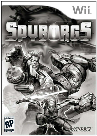
SPYBORGS Pack Front: From Concept to Final
Aug 01, 2009 // Grant
So a couple weeks ago I posted the final Spyborgs pack front and got a great response from you guys as well as on other websites. Well, as a Capcom first, I wanted to share how we got to where we did. We worked with one of our agencies, Ayzenberg , to handle all the packaging, website, trailers and most other marketing visuals. The above image is one of the many concepts we received showcasing this high-powered team of cyborgs. I’m going to take you through how we got from start to finish. Keep reading as it’s quite interesting…I promise!
We look at Spyborgs as a “super hero” team…I mean they’re superpowered, act as a team, fight for justice and kick a lot of butt….they’re basically like the Superfriends, Avengers, etc. So, when we provided direction for the pack front, we looked for comic book covers first. This provided us a good foundation for how best to showcase a team. Our objective was to create heroic poses, promote a team, and show action. We did not need to be literal about it (i.e. actually shooting/punching something), and I think we ended up in a fantastic place.
The image leading this post was one of the first concepts we received. It was designed like a movie poster – where the baddie was in the background and the characters looked at the viewer. It actually was a strong contender, but it felt too familiar with the ominous presence behind them and their heroic poses. It didn’t stand out as “fresh and new”. Don’t get me wrong, this would’ve been a great direction to go as well. But I think ours was more original and more interesting – What the heck are they charging at offscreen??
Below are several other concepts we received.
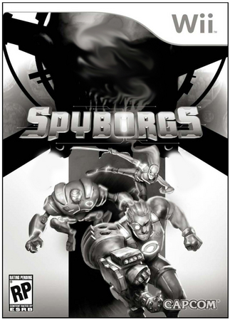
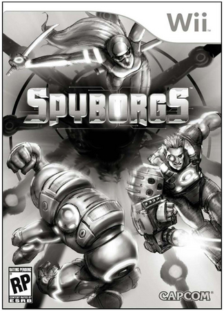
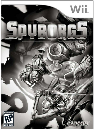
The last image was a form of the direction we ended up with. The background image was a bit cluttered and because the good guys were going the same direction as the bad guy, it was a bit of a confusing message who the guy in the background was.
Below is how we continued to refine the image…
One of the problems with the last image is that the characters were going to the left. this made sense because of Stinger’s gun arm. It’s so big that if you have him face the right, it covers up his body. So the designers tried a version of him going left, but what happened is that his body language became very passive. He wasn’t firing that awesome gun of his…and that was important to show.
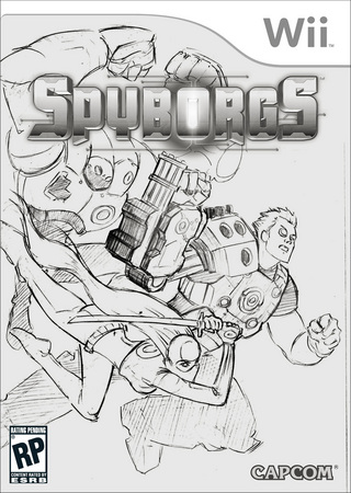
So we asked them to take another stab at it….it was better, but he strangely took on an Aquaman type pose…where he nosedived with his arm. Only thing missing was his fishhook hand.
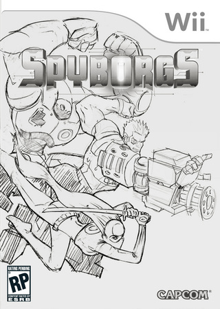
So Ayzenberg went back to the drawing board, and this time they were definitely on the right track. We were quite happy with this, but still pushed to get his arm language down correctly. Bouncer was also too small. They did an awesome job the next round.
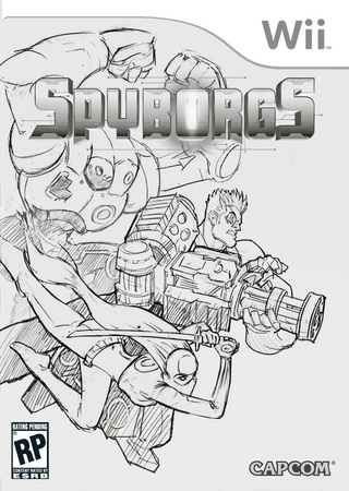
So here is where most of the final image was refined from…
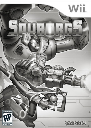
We wanted to place more emphasis on Stinger and Bouncer because we found through focus tests that Stinger and Bouncer were the favorites. Because of this, we moved Clandestine’s hotness up, and slightly “back” so that Stinger’s design could be seen in all his machine gun blasting glory.
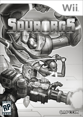
This still wasn’t quite right, so in the near final version, we pushed Clandesting to behind Bouncer….and then it finally seemed right. We also adjusted Stinger’s arm so that it was firing forward instead of down.
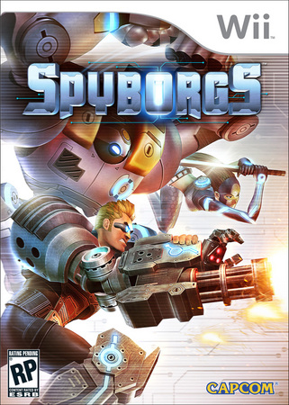
The above image was one of the first passes at color – we ended up going with the darker image that you see below. There were many more steps in this process – lots of slight shifts, special effects and lighting tweaks – but I’ll save you from the boredom of it all. Ayzenberg worked extremely fast, and they exhibited amazing skill at addressing our comments.
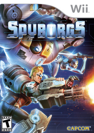
Overall, the process took several weeks and it’s amazing what even the smallest tweak can do to the tone, message and more of the image. That’s about it…hopefully this was more interesting than boring!
-Grant
-
Brands:Tags:
-

Loading...
Platforms:
