Saying Goodbye to Nintendo Power
Jan 05, 2013 // Chris
Highlighting our favorite Capcom covers from one of the greatest magazines of all time…
As the Unity team slowly returns from holiday travels and reconvening back in the office, we’re going to be taking the occasional look back at the year that was. As far as 2012 goes, we’d be terribly remiss if we didn’t take a moment to bow our heads to one of gaming’s most important publications, Nintendo Power, which sadly ceased publication last month.
For almost 25 years, Nintendo’s official magazine dispensed the clues that you can use , and we’re immensely proud to have been even a small part of it. Capcom games graced the cover of Nintendo Power more than twenty times , and without doing the proper research I’d still wager to bet that’s more than any other third-party publisher (prove me wrong, internetz!)
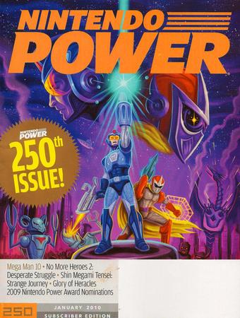 FUN FACT: Mega Man’s been on more covers than Street Fighter and Resident Evil
But it’s not just about official recognition here. If you’re around the age of Brelston and myself, your world was virtually shaped by each and every issue on Nintendo Power. In a time before Xbox and the internet, this monthly tome was basically the authority on everything related to video games when the NES and SNES dominated the industry. And without the wealth of gaming information we enjoy today, I know I’m not the only one among you who read each issue over and over again. New games didn’t truly exist until Nintendo Power said they did, and in-game secrets were nothing more than schoolyard rumors and hearsay unless printed within its pages.
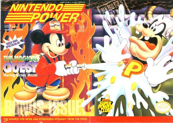 Nintendo Power’s first fold-out cover features Mickey’s Magical Quest and a “Mega Man Spectacular” for a double dose of Capcom love!
Brett and I were also fortunate enough to occasionally write for Nintendo Power during our time in the gaming press, and I honestly can’t convey what an honor that felt like. So with all that in mind, we both decided to highlight our favorite Capcom covers from Nintendo Power’s proud legacy as a tribute to one of the greatest magazines ever made. Feel free to share you thoughts below, or underneath each individual cover in our chronological gallery .
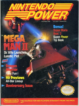
BRETT: I cannot overstate how this issue changed the course of my entire life. Those carefully made clay figurines, the mystique added by weird lighting, the fact that Wily ship may still exist somewhere… so many memories. The article made me a Mega fan for life with its level maps, cool art and excellent run down of why it was such a huge release. If you could own one issue, this should be it.
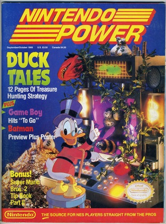
CHRIS: Sweet Jebus, look at this thing! Although it may look like a garish 90s relic featuring Scrooge McDuck standing atop some Cyberpunk Acropolis, take a really close look, DuckTales fans. It’s actually Scrooge’s Duckberg computer (the game’s level select menu) adorned with numerous elements from the Amazon stage. It may appear as odd or unrelated, but it’s actually outrageously authentic! I’ll never be one to harp upon the death of analog design, but you don’t get any more “hand crafted” than this. Today it’s a rarity when magazines employ custom art or photography on their covers. This one was literally sculpted.
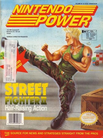
BRETT: By this time, SFII was already massive. Like, every kid in the country was either playing it or knew what it was, and now it was coming home. A weird, magical feeling, to know your SNES could handle the game that’s already eaten $100 of quarters in the arcade. But with all the hoopla and system-selling power of this cover, the best line was “Hair raising action?”
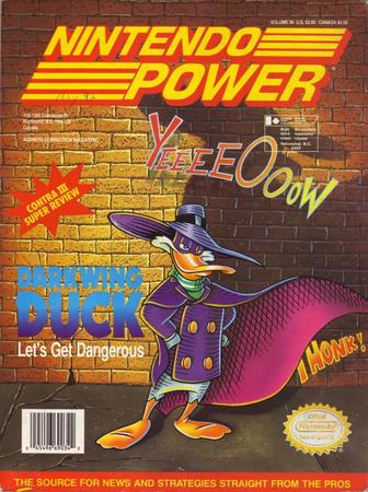
CHRIS: Behold: The Terror That Flaps in the Night… doing a quick set at The Improv apparently… (What was with Capcom and brick walls back in the 90s anyway?) I have no idea where those text splashes came from, but they’re certainly not indicative of the amazing game that Darkwing Duck is. Yeah, it’s not the greatest design here, but I’ve highlighted it as further evidence of just how well Capcom handled games in the Disney franchise. Nintendo Power proudly showcased Capcom/Disney games across its cover at a rate of about two a year back then. That’s impressive in and of itself, and even more notable given that once Capcom and Disney’s union ended, almost no Disney game landed a cover for almost 20 years (Epic Mickey.)
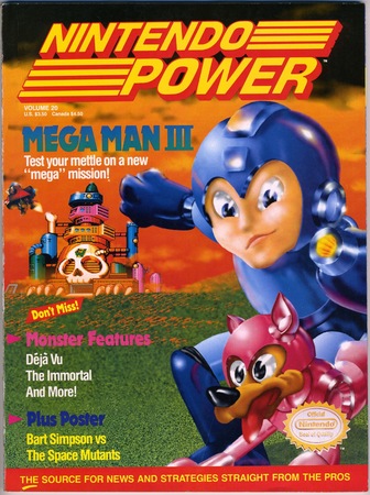
BRETT: About the weird cover art… there was a series of covers in this time frame that all sported this general art vibe, meaning we get a bizarre looking Mega Man and Rush staring right at us. But hey, is that the MM2 Wily machine pasted into the background?
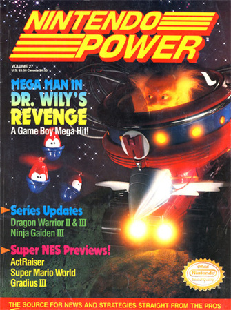
BRETT: Another amazing custom cover! This is how it used to be done, kiddies – with no official art or usable screens, editors had to dream up scenarios for the oh-so-important cover. Very creative and definitely made a big impact on me as a kid. Can’t say I was as pleased with Dr Wily’s Revenge, though (luckily the later GB games more than made up for it).
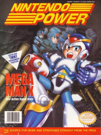
BRETT: The Mega Man 2 cover all over again, though with official-ish art. The impact of this sleek, new Mega Man reignited my passion for the series and the world and is no doubt one of the bestselling issues ever. I suspect many of us read this issue over and over again, just to look at tiny, fuzzy X screens. And that’s an important thing that’s basically gone now – pouring over magazines with a friend, obsessing over little details and reading every caption a hundred times. Those 300 page EGM and Gamepro issues were amazing for that, and now with more and more magazines falling off… it’s sad to think most people will simply look at a computer screen. I mean, uh, please click around Capcom Unity!
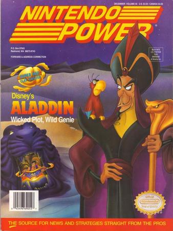
CHRIS: This one brings back a bit of regret for me. In case you couldn’t already tell, I’m a huge Disney dork, so Aladdin was a huge deal for me. Smack dab in the middle of the SNES vs Genesis console wars was the Aladdin game, with the Sega version designed by actual Disney animators, and looked like a giant leap forward in offering fans the feeling that they’re actually playing the movie. Everyone wanted the Genesis version, and Capcom’s SNES version was overlooked for looking too, well… gamey, I guess. Aladdin was an enormously decisive factor in getting a Genesis for me, so it wasn’t until years later that I actually discovered Capcom’s game was markedly better, playing much more like a solid, timeless platformer and a helluva lot less like a floaty Flash game you’d play in a browser. Sorry, bosses…
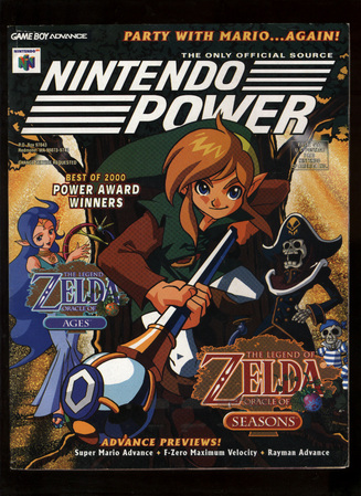
BRETT: What’s this? Capcom-backed Zelda games? Why, yes! The Oracle games hit Game Boy Color on the same day in 2001 and, while oddball entries, were totally solid and worth playing today. Pity they landed just before the GBA, and were perhaps overlooked by the millions who bought Link’s Awakening. Always did love the official art for Link, Din and Nayru.
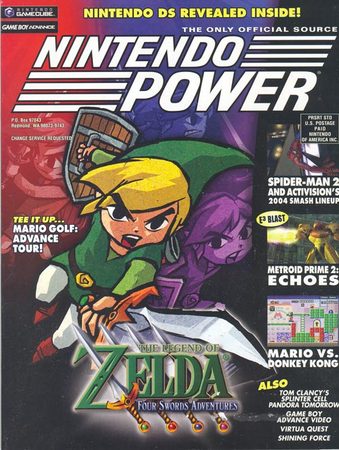
BRETT: While Flagship did port Link to the Past to GBA, it also assisted development of this inventive GBA/GC crossover title. The best way to play was grabbing three other friends with GBAs, link cables and a lot of time to spare… the solo campaign was fun but nowhere as cool as four Links running free. A very cute entry that shouldn’t be dismissed as “what, a multiplayer Zelda?”
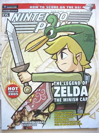
BRETT: Another Capcom Zelda game, and one of my favorite Zeldas to date. So much, in fact, that the kinstone design in the background is permanently etched into my right arm! Just one of four Zelda tattoos I currently have, with plans for more. So, as a Nintendo and Capcom nut, Minish Cap represents the best of both worlds.
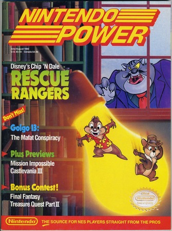
CHRIS: I love this cover because it’s a shining example of a designer doing the best they could do with provided key art. Disney’s rightfully very careful with their characters, so I’m guessing what’s happened here is that they provided NP with only a few tiny pieces of art (The Nintendo Seal of Qiality is almost as big as Dale.) Rather than mercilessly stretch and blow out the chipmunks and Fat Cat, it looks as if someone painstakingly recreated a large custom motif from one of Rescue Rangers’ levels with an incredible eye for detail, then worked Chip n’ Dale into scale.
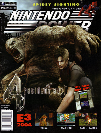
BRETT: Seeing as RE4 began life as a Nintendo GameCube exclusive, this was a huge get for the magazine. Good use of official art too, as the dynamic poses suggest something more limber than the usual RE experience. Flash to today and RE4 remains my favorite RE title and IMO one of the most influential games of the past 10 years, period.
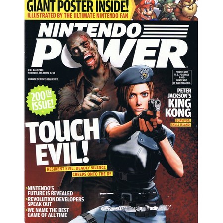
BRETT: Man, that Shinkiro Jill art is one of my favorite pieces. Deadly Silence is also one of the first games I reviewed upon entering the games industry back in 2006, so that time period – and this cover – have a special place in my heart.
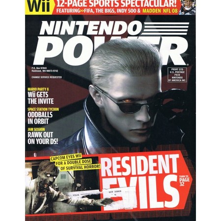
BRETT: Oh, that Wesker! A slick new piece of art makes for one of the most striking NP/Capcom covers of all time.
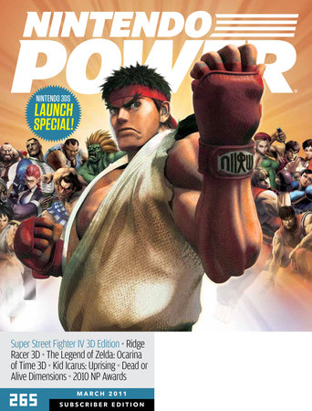
BRETT: By the time this issue hit newsstands, I was already talking to Seth about coming to Capcom. Funnily enough, I think I interviewed Ono-san right around this time too, about this game!
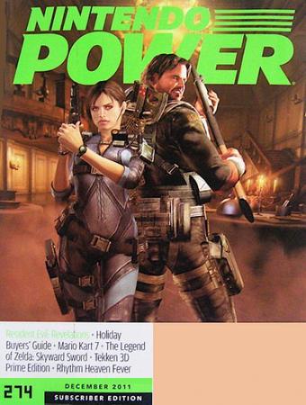
BRETT: And we end on Revelations, the one Capcom cover featuring a game I worked on as community manager. It’s weird seeing them all laid out like this; that MM2 cover came when I was eight years old, and by the end of the line I’m working at Capcom. It’s surreal. And even though the magazine is gone, that team (who I worked with at Future publishing) is awesome, passionate and will no doubt continue making great content.
Fare thee well, Nintendo Power… You made and immeasurable contribution to the gaming as both a business and lifestyle, lifestyle. To say you’ll be missed is perhaps the understatement of 2013. Feel free to leave your rememberances below, or check out even more Capcom Nintendo Power Covers in our Gallery.
-
Brands:Tags:
-

Loading...
Platforms:
