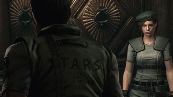
Resident Evil screen slider comparison
Aug 27, 2014 // Minish Capcom
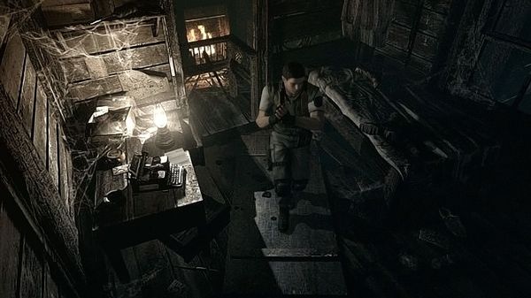
After seeing the new screens and information about 2015’s enhanced version of Resident Evil, I took the time to play through the 2002 version (or more specifically, its Wii port) and grab some screenshots that lined up with the screens we posted alongside the announcement. As you might expect, the new version looks pretttty nice!


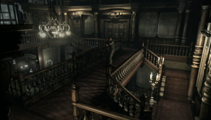
In case your browser acts up, some instructions: Click/hold on the green bar and then use the mouse to scrub left and right to see the comparison. You can also click the text on either lower side to quickly scroll from old to new and back again.
Note: The 2015 RE screens are from a game that’s still in development. The Wii screens were taken through component cables to provide the most typical result. I then shrank the 2015 screens down a tad so they were the same size as the lower-res Wii screens.
Alternatively:
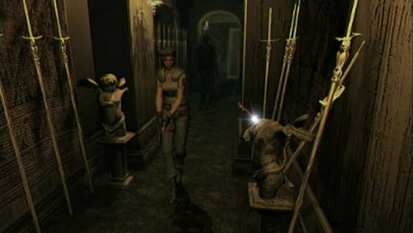
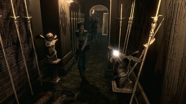

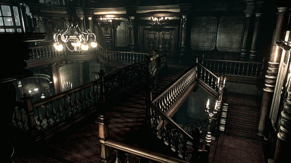
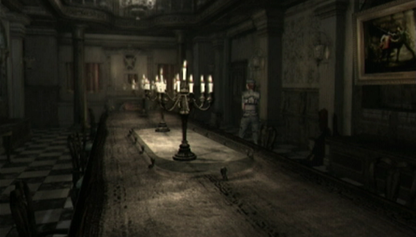
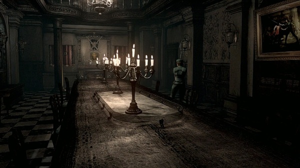
A few of these images made the rounds during announcement in Japan, but today, here they are for the rest of us!
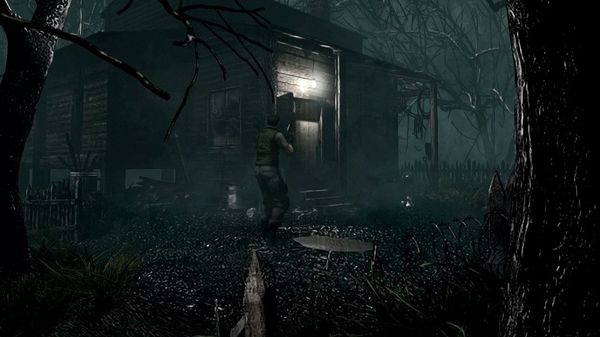
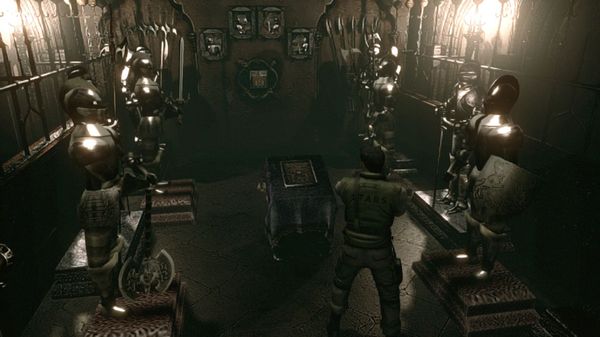
-
Brands:Tags:
-

Loading...
Platforms:
