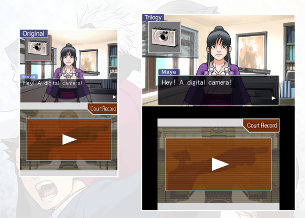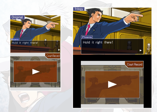
New Ace Attorney Trilogy comparison screens show difference in visual quality
Sep 24, 2014 // GregaMan
Those eagerly anticipating the arrival of Phoenix Wright: Ace Attorney Trilogy for the 3DS this winter will definitely want to check out the following comparison gallery, which provides a good idea of just what kind of facelift these handheld classics are getting. All screens in this batch come from the very first Phoenix Wright game, originally released in the west on the Nintendo DS in 2005. Feels like just yesterday.
Look and see!
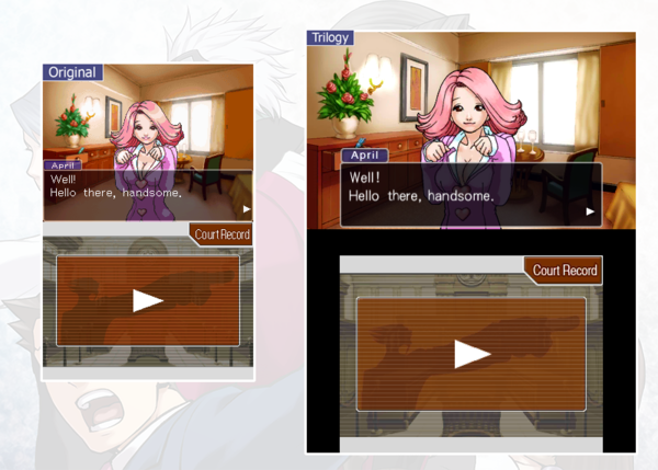
↑ Check out the difference in her hair.

↑ Samurai Dogs stand is looking pretty sharp. Plus you can see that trash can now!
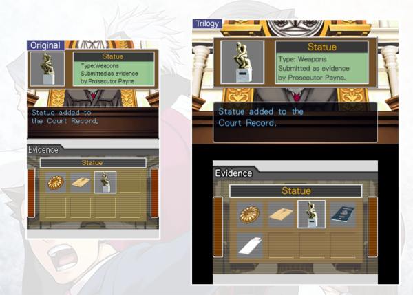
↑ Looking much more statuesque now.
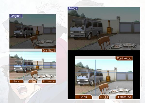
↑ The clearer graphics will definitely help when searching for clues.
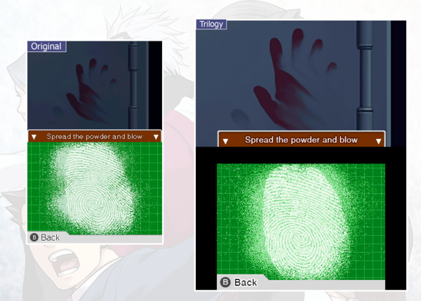
↑ In real life, improved fingerprint imaging might actually have bearing on the outcome of a case. Here it just looks purty.
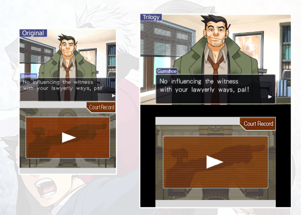
↑ Check out that painting.
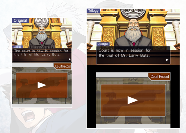
↑ The judge’s beard has undergone some serious improvement. So smooth! Also note the etched patterns behind him.
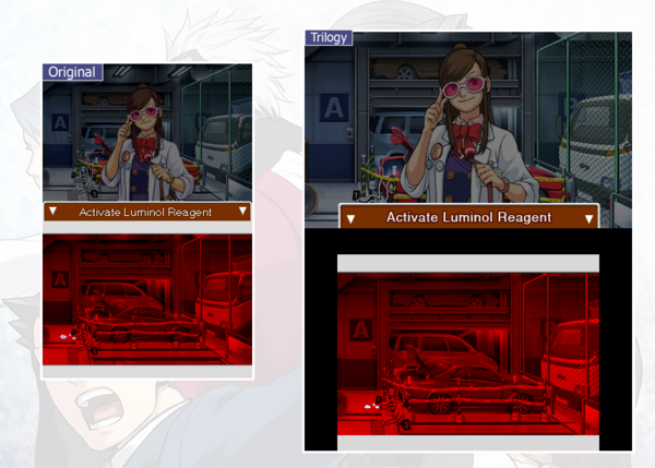
↑ Luminol.
↑ Same digital camera, more pixels. Dahaha.
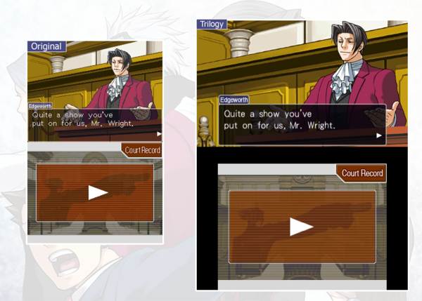
↑ More like Miles Smooth edgeworth, amirite?
↑ The finger of justice has never looked better.
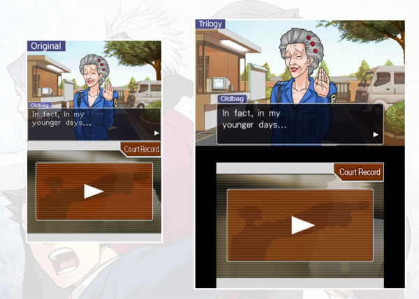
↑ I swear she looks five years younger.
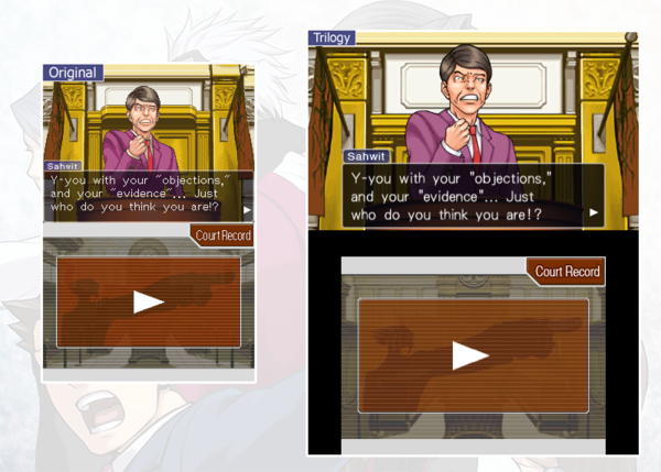
↑ His smooth, shiny hair only incriminates him further.
Hope you enjoyed! The Trilogy will be out on the 3DS eShop sometime this winter. More blogs to come soon!
-
Brands:Tags:
-

Loading...
Platforms:
