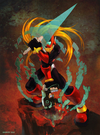
Mega Man Zero Collection Art Contest: Week Three Winner & Entries
Jun 03, 2010 // jgonzo
This week was very tough for us on the judges panel, as we were inundated with a lot of quality entries! Ultimately, Khuntry blew everyone away with his (or her) rendition of Zero, as seen above. Congrats! You win a copy of Mega Man Zero Official Complete Works (courtesy of Udon) and a copy of Mega Man Zero Collection for the DS!
From the judges:
bastion: This is a strong dynamic pose and composition that is really helped out by the painted style and choice of colors. I enjoy the fact that a lot of the entries we see are taking the characters to a place outside of what we are used to seeing, even if it is only just a few degrees off of the norm. Nice work.
joveth (jgonzo): Wow. I’m not sure what to say…this is the most BAD ASS rendition of Zero that I’ve seen. He really does remind me of some sort of future space cowboy with his weapons in hand, ready for battle. I’m loving all the attention to detail!! Wow.
Seth (s-kill) : Really just blows me away. Dramatic pose, amazing coloring, and I’m loving the swirling digital “bit” effects. Really pro stuff here.
Shawn (snow): SO AWESOME. <3
Hit the jump for the rest of our top five, honorable mentions, and the rest of the entries with bonus comments from me for each piece!
Update: Can’t believe I left out the two video entries we recieved! Don’t worry, they were judged along with the others, I just forgot to add them here. Check them out as well after the break!
2nd place: Not Another Zero Fan
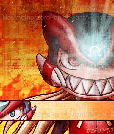
…So, the reason for this… Well, I was trying to decide on whether to do something semi-abstract or chibi. Both were appealing to me at the time, as I wanted to draw a crazy chibi, but I wanted to also do something abstract. After having a chat with Goku-san, she nudged me in the direction of both (so, special thanks to her ^_^).
bastion: I love the personality that comes through immediately in this piece. The gritty textures and hot colors add to the sinister feel and sense of being up to no good. This is true to the look of the character while bringing a style we wouldn’t normally associate with Mega Man art.
jgonzo: hahahahaha….I can’t stop smiling at this evil chibi face! I want to go “dawwwwwww!” and “ahhhhh!” at the same time! This is a really cool, unique representation of Omega!!
snow: I like how different this piece is from everything else. It reminds me of the moment before the fight in old kung fu movies, where they zoom in on the eyes.
3rd place: Nemesi
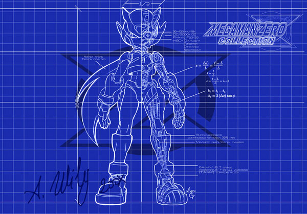
During game three, us players are lead to the discovery that Zero’s body has been stolen, and that our hero is operating a lesser copy. I guess Weil – or rather, whichever scientist built the fake body into which Zero was later uploaded – needed a schematic of Zero’s inner workings, in order to complete his work.
And that’s where the proverbial lightbulb… lighted on.
There’s something about android, cyborgs or robot’s blueprints that makes them fascinating; makes them more meaningful than x-ray sight of a machine’s innards. There’s something… undefinable, in watching a human shape filled with mechanisms that are to complex to fathom.
I fell for that idea and went with it, very fast.
To my knowledge, there’s no “official” blueprint of Zero from the Zero-era/Zero-Saga. So I pulled up the two original sketches of Zero from the X saga that showed his inner workings, and sort of “adapted” the mechanisms shown there to the new body.
Later, I tried to incorporate the blueprint into a more complex painting; but the result was dissatisfying. Besides, between resizing, image distortion, light effects and whatnot, you couldn’t see all the subtle details I’d spend hours upon, anymore!
So I decided to enter the blueprint as it is. 🙂
bastion: As a kid one of my favorite pieces of anime art was a cut-away schematic of the VF-1A fighter from Robotech. This piece brought me right back to that. There really is an inherent coolness to schematics and Wily’s signature is just a nice touch.
jgonzo: This is pretty incredible that Nemesi was able to put this together on his own! Awesome work!
s-kill: What can I say? I’m a big sucker for schematics and tech breakdowns. The grids and numbers, fake as they may be, always made things like the Enterprise and Robotech feel somehow more grounded and real, so very happy to see Zero get the same treatment. Signed and dated by Wily is just lulz.
4th place : Aoi
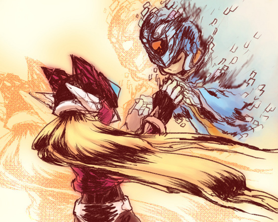
jgonzo: This is beautiful. I like the colors and the art style and the powerful message that this conveys about Zero and X’s relationship.
s-kill: Really beautiful use of the rougher pencil style, with lots of drama, emotion, and lovely little touches.
snow: Love the color and style. It has that old movie poster vibe that just makes it rock.
5th place: Nguyen
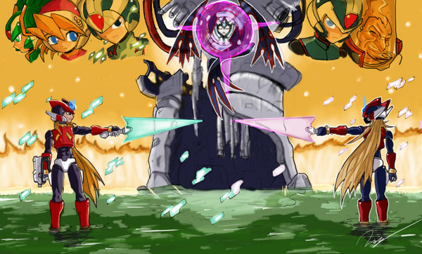
The Battle to determine who is the real legendary hero. This is my favorite part of the game, I hope you guys like it :D.
jgonzo: Really, really, really fantastic work on this! Not only are Zero and Omega artfully portrayed, but the anime-esque faces in the upper half are incredibly detailed and well done! This was a tough week for me to choose a favorite, and Nguyen didn’t help me much with this amazingly talented piece.
Honorable Mentions
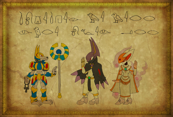
Ever since Pharaoh Man from Mega Man 4, I’ve been interested in Egyptian Mythology. Anubis Necromancess III in Mega Man Zero was a nice surprise, a robot based on my favorite Egyptian God! I knew I had to draw him for this contest, and since he’s restored in MMZ3 as Anubis Necromancess V, I figured it was the perfect oppurtunity! Devilbat Schilt and Cubit Foxtar appear here, with bodies like their human form and heads like their animal form, this is to go with the Egyptian theme I had going with Anubis Necromancess. This is supposed to be some kind of alternate scenario, where Anubis recruits them instead of serving Weil. The heiroglyphics are his words to them, they aren’t just random! I may have messed up the translation, I’m not that good with other languages. The Ankh is based on the god Anubis, who carries one in some interpretations.
s-kill: Not sure exactly what’s happening, but I love the hieroglyphic direction here.
jgonzo: I really appreciate the different approach in this piece! It’s really unique to go all the way with the Egyptian theme and the fact that the hieroglyphics are actually representative of Weil’s words is beyond awesome! Great work on this Duckaiser!

s-kill: I really liked the mixed media of pencil and watercolor. Tells a simple story but with a lot of raw emotion! Fantastic smirk on Omega Zero.
jgonzo: Major props for taking the time to paint this the traditional way! You have great potential, Zero Blayd! Keep painting and showing off your dedication and passion for Mega Man!
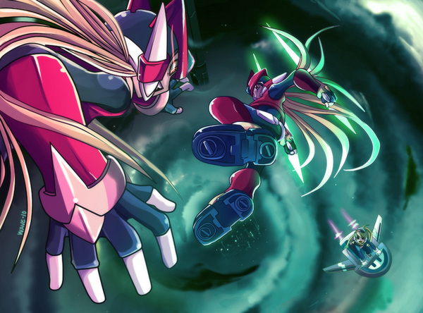
Zero vs Omega in the skies, with Ciel being her worried self.
jgonzo: The perspective on this piece is phenomenal! I really like Wave’s art style and the whole piece as a whole! It’s truly breathtaking.
The rest of the awesome entries!

This is where Zero comes to Fefnir (Fafnir) and Leviathan’s rescue. also in this pic you can see Omega’s shadowy silhouette in the picture if you look hard enough into it, there you find why it is so dark. I wanted to give this piece the Megaman Zero commercial feel especially the Megaman Zero 2 commercial.
I did the intro scene because everyone was pretty much drawing the ending with Omega Zero, why not go the opposite and start at the beginning?
jgonzo: I like the art style of this piece, and I’m enjoying how Advent Axl continues to be more and more creative! I would love to see a more dynamic scene depicted in the future 🙂
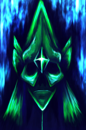
Deathtanz Mantisk is one of my favourite bosses. As a Weil Number he’s eccentric and kinda cool at the same time.
jgonzo: I like how ominous avroillusion was able to make Deathtanz Mantisk with this depiction. It would be awesome as part of a series!
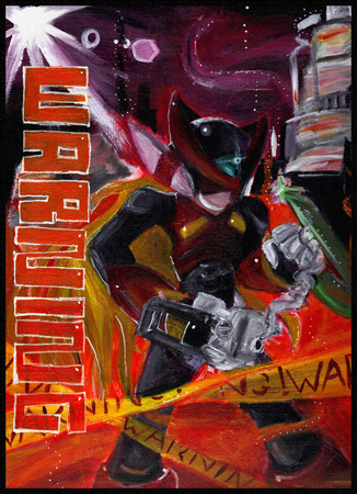
This is Omega. He likes sharp objects, but he hates you. Not a good combination. Ask anyone that’s played MMZ3, and they will remember Omega…I haven’t played MMZ3, but I still remember Omega. I thought I’d use acrylics again since my last entry went down so well. And yes, I’m aware that Omega is holding a non-existent weapon in his left hand. But eh, I’m happy with this overall.
jgonzo: I’m digging the acrylics and the bold art style! The only minor thing for me is that the piece as a whole is just a tad bit too busy.
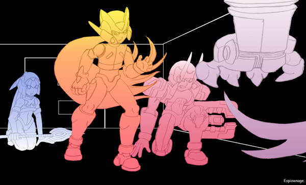
Anyway, this is my take on the early scene of Zero’s first encounter with Omega. It stood out to me just because I’ve never seen the Guardians thrown around so helplessly before (besides Harpuia of course). Makes it seem like Zero is going to have a tough battle to fight, but in reality it’s just an intro boss lol.
jgonzo: I like the details on each character here, but it seems as if the piece is incomplete?
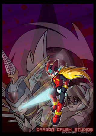
This was quite challenge trying to add all of the characters in. I was going for the promo image look like I’ve seen a lot of images of for the games.
jgonzo: Good work overall, Goku-san! The piece seems a bit cluttered in the lower middle area (it’s difficult to make out the main background element) and there’s a lot of unused space towards the top, but I like the art style!

“Light and shadow” from RTRZ Telos.
(Due to time constraints, I’ll leave the epic omega battles to everyone else. 🙂
jgonzo: Amazing. I love how dramatic all of HJ’s pieces have been, and their power to evoke an emotional response!
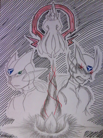
jgonzo: I see potential in this piece! I’d like to see the fully colored version of this 🙂
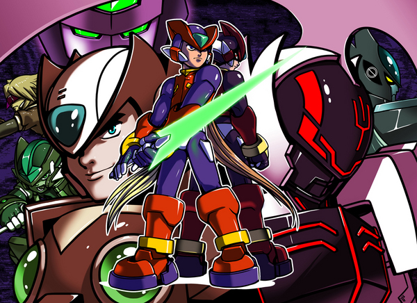
To think that Zero became such a fan favorite character in the Mega Man series, now there are so many versions of him in almost every corner of the Mega Man universe. I thought I’d just pay tribute to that.
jgonzo: Awesome work by Kaigetsudo! This is a great tribute piece to the character(s) we all know as Zero! It reminds me of Tabby and AWD!’s collaboration entry for Mega Man 10 .
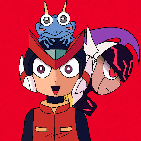
The box art of Mega Man Zero 3 in the style of the series manga.
jgonzo: Cute! I like the look of this piece.
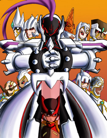
In this drawing i thought to draw Omega, Weil, and The number bosses because i believe they depict the great excitement to the zero series.
jgonzo: I really enjoy the composition of this image…it just flows very nicely…and ominously! The art style is also pretty unique and stylish. Good job all around!
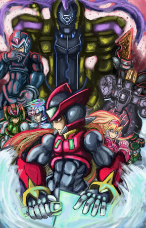
A drawing combining aspects of the intro as well as the characters provital to the plot. I made Omega very imposing. Since I considered him to be the main obstacle of this game that Zero must overcome, for the peace of the world as well as his own sake.
jgonzo: Very good use of colors on this piece, and holy crap! I never realized how buff Zero and Copy X were! 😉
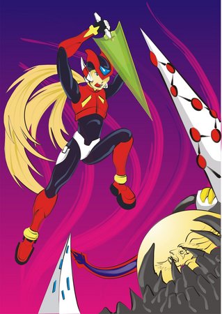
This is the better moment in Megaman Zero 4. The final battle!
This is the part of the fight that Zero give’s his last strike on Weil. A pretty cool moment for me.
jgonzo: You can feel the tension of all the previous games being released in this moment in time that Rafa managed to capture expertly. I like his unique style! The only advice I would give is to try to make the image more dynamic in some way.
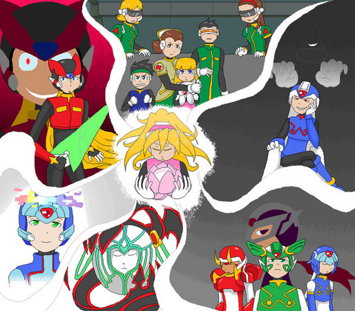
Megaman Zero 3 is my favorite game out of the series, and I really hope I was able to convey some of the main conflicts of the game and emotions of the characters. I really love this series as a whole and I hope that shows in my artwork.
jgonzo: Your passion for the game really shows with all the effort you put into making this piece! I like how you managed to convey a ton of information in a single piece, bringing it all together with the lovely image of Ciel 🙂
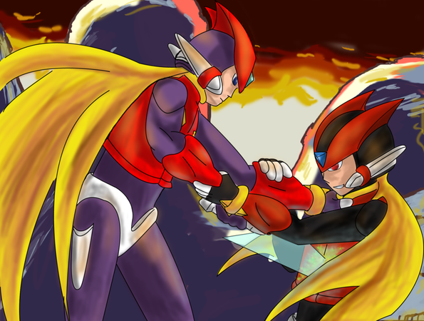
jgonzo: This has a pretty cool use of background colors and effects! The only thing that I would recommend is working on the posing of the main subjects, as it took me a while to realize that Zero was plunging his z-saber into Omega and not embracing him.
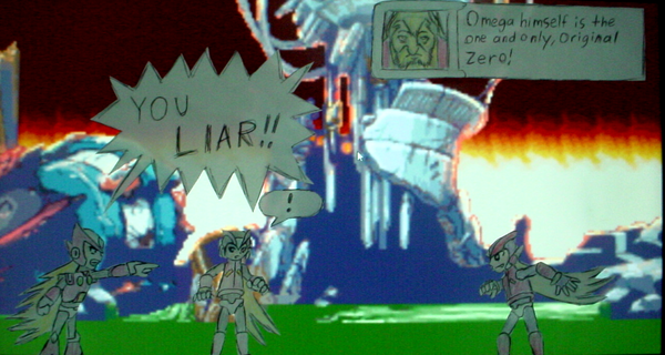
I’m sure this idea crossed everyone’s mind when this scene came up in Zero 3. It’s even crossed Zero’s!
jgonzo: LOL. The lack of round chest orbs was a dead giveaway 😉
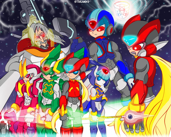
Title: Two Sides!
I decided to draw Zero, X (elf version), The Guardians, Dr. Weil (Broken Helmet Version for get full badness on his face), Omega Zero and Copy X for this Epic Moment!.
My idea is show the most important characters! A Clash of Heroes and Villains: The Good side (Zero and friends) and the Dark side (Weil and bosses). The fight begins now!.
jgonzo: I like the use of colors on this! It’s easy to forget, amidst the doom and gloom storyline of Mega Man Zero, that there are some beautiful, colorful character designs.
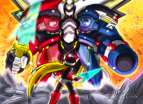
Title: Zenith Crux
When I brainstormed about how I would’ve made an MMZ3-related fan art, I wanted to draw Omega but at the same time was hesitant because of his detailed design. Eventually though, I dove into the temptation of drawing Omega in his ultimate form. In summary, making this artwork was like battling Omega myself as an artist.
I personally think MMZ3 would be the pinnacle of the series. Compared to MMZ4, I think MMZ3 was more exciting in regards to plot, not to mention the hardcore battles between Zero and Omega all in one go. Zero was originally built to bring destruction, but the irony is he’s prevented it.
jgonzo: What an epic scene to depict! Poor Zero looks like he’s about to be stomped out of existence! Susan did a great job portraying that sense of hopelessness in the face of evil!
Kind of new at submitting for things like this, and MMZ3 was my favorite game in the series. I even love one of the bosses in this game.
This one depicts the final battle of Zero and his original body. There wasn’t much I could do with it due to the limits. But I think I’ve managed somehow.
jgonzo: Very creative stuff! 🙂
I figured since I have been doing all this anime looking pics i might as well try and actuly animate one of them. (SPOILERS) I thought the part where Zero’s “real” body shows up with all the fire and what not would be cool to see.
jgonzo: I love the fact that R.Case is experimenting with animation, especially, as pointed out by R.Case, due to the fact that the artist has produced some very slick, anime looking pieces! I wish there was more animation to this, but this was pretty cool!
-
Brands:Tags:
-

Loading...
Platforms:
