From the Desk of DVZ 8-bit Artist Paul Hubans
Feb 16, 2010 // Shana
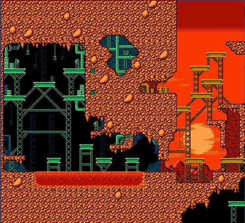
One of the biggest challenges with putting together Dark Void Zero was in reconstructing the art. We knew we had a huge task ahead of us, but fortunately, we had the right man for the job.
Below? A little chat with Mr. Paul Hubans, Dark Void Zero’s background artist and retro game resurrection artist. Check out the snipet below, and click through to get the lowdown on the whole art creation process!
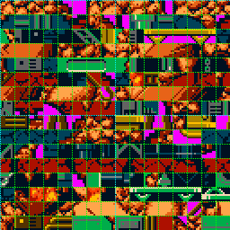
 Fortunately, Other Ocean studio was able to rip out some of the game’s original graphics, salvaging what they could in the form of what appeared to be incoherent mosaics with only hints of recognizable pieces. Poring over these garbled tilesets of days long gone, I was reminded of my teenage ROMhacking days when I would use similar tools to alter the tiles of my favorite NES games. 8 x 8 tiles, 4- color palette restrictions, and finding out how to fit all these tiles together properly to form an image that made sense was all too familiar to me. Now, it was my task to find out what Capcom was originally trying to say with this code of imagery.
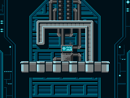
On the NES, tiles are limited to 8 x 8 pixels, and the real challenge is in how to express detail with such a minimal amount of canvas. Ideally at this scale, less is often more, so it’s best to employ a minimalist approach instead of trying to push in too much detail. In many cases, for obvious reasons, a single 8 x 8 tile isn’t sufficient for creating graphics with a strong aesthetic, so tiles are brought together to form a whole. In effect, these tiles work only as the parts of an image rather than the image itself. For example, if you took one of the computer terminals found in the first level and broke it down, you’d find that it is actually made of six of these 8 x 8 tiles, each forming one part of the image.

Another restriction of the NES is the color palette. The NES hardware can only support 4 colors per tile, and one of these is transparent. Additionally, there are a total of roughly
 Working with the team at Other Ocean Interactive to bring this otherwise unknown treasure back from the grave was both an honor and a delight. Most of the communication with the development team was made online, since they are
  based in
-
Brands:Tags:
-

Loading...
Platforms:
